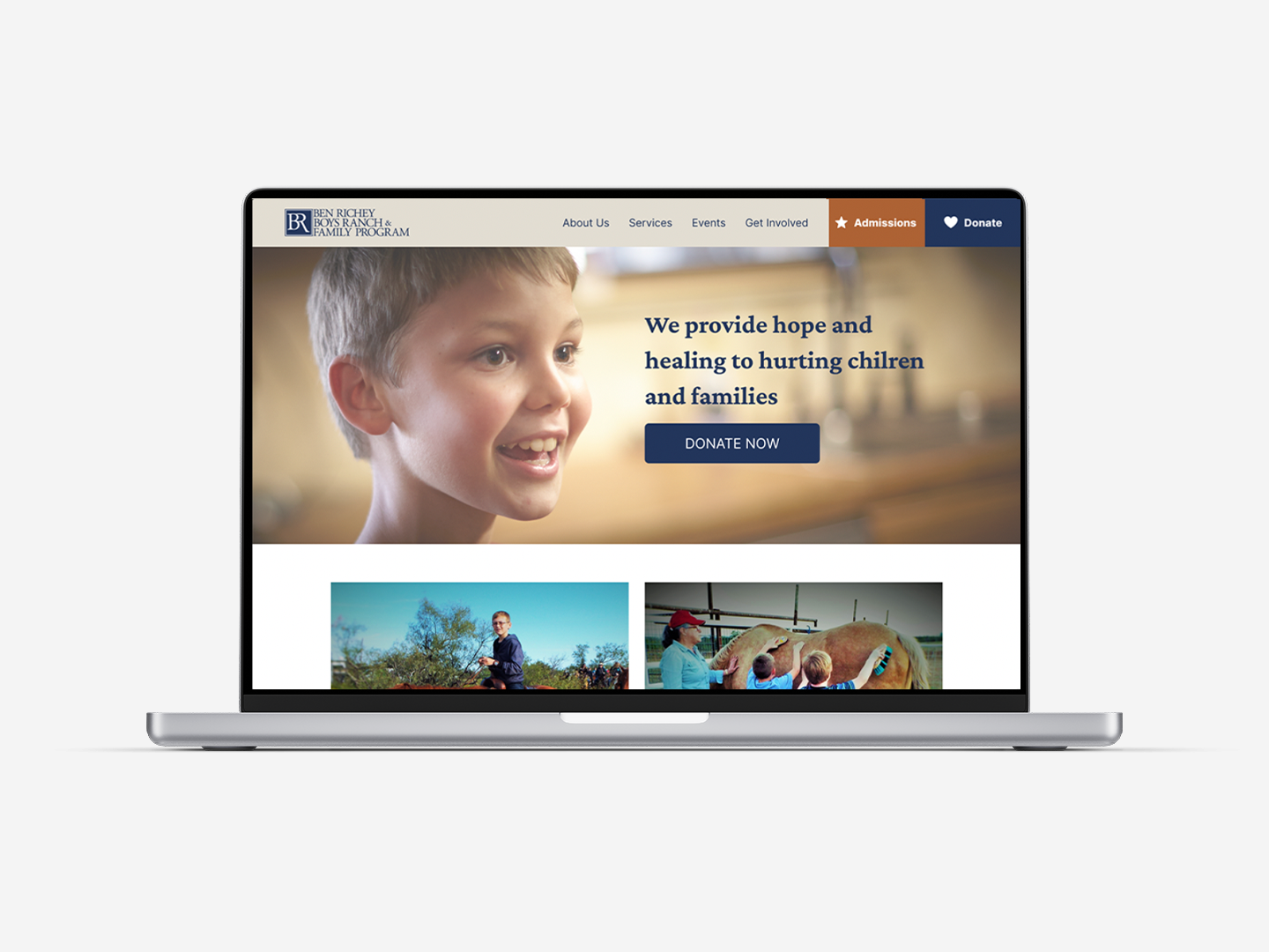
Ben Richey Boys Ranch Website Redesign
ROLE
UI/UX Designer
SERVICES
UX Research
Design Strategy
Prototyping
Usability Testing
PROJECT TIMELINE
80 Hours
TOOLS USED
Figma
Adobe Illustrator
Procreate
DELIVERABLES
Responsive Desktop Design
Project Overview
Ben Richey Boys Ranch and Family Program is a non-profit based in Abilene, Texas providing childcare and life skills to boys who cannot live at their homes due to safety concerns, and also providing single women and children a safe place to rebuild their lives from unstable backgrounds.
Problem
Overall, the website is a little outdated and doesn’t convey the confidence and trust a potential client or donor should have when getting involved with an organization. More specifically, Ben Richey Boys Ranch wants to improve their online donation process to attract new donors and simplify the online giving process. The current donation page does not does not give the user confidence in donating to this organization.
Solution
In order to optimize this website, I created an experience that makes the user feel connected and involved with this organization. As a 75 year old organization, Ben Richey Boys Ranch has a trusted reputation in their community so I created a website that gives them credibility online as well.
Research
I began my research by talking with Ben Richey Boys Ranch’s Director of Development about the issues she has with the current website. I learned that currently most of their donations come through the mail rather than online and she’d like to increase the number of online donors. I also learned that their donors are from all over the country, but most give because they or a loved one have been personally involved with the organization.
With these things in mind, I conducted a survey and user interviews to get an idea of how and why people give to nonprofits and found a few key insights to take into the next portion of my project.
People give because of personal connections. It was clear from both my survey and user interviews that people give because they are somehow personally connected with the nonprofit.
Donors want to be able to trust the organization they are giving towards but they don’t necessarily look at their financials to be able to do that. The trust comes from being personally involved with the organization, or, at the very least, having trustworthy information on the website. This could come from donating to a certain need or program or knowing how the organization is using the money.
The majority of people give online. While some give through event tickets or text to give, online was the highest option by far. The team at Ben Richey Boys Ranch said that the majority of their donations come by mail, but based on this research I know that people prefer to give online and in order to keep up with moving trends we must create a user-centered donation process to help people give with ease.
While the purpose of this project is directed towards donors, the team at Ben Richey Boys Ranch was clear that the main target audience is people they serve. In my survey I found that 90% of participants’ main factor to consider before donating is the services the nonprofit offers, followed closely by the organization’s mission. I originally thought of donors and clients as two separate targets with conflicting motivations for visiting the website, but through this research I found that both of these audiences want to know what the nonprofit has to offer and that needs to be at the forefront.
Competitive Analysis
While it seems odd to review other nonprofits as “competitors,” there are a few other organizations in West Texas that have similar missions and programs. When a donor is looking to give to a boys home, Hendrick Home for Children and Cal Farley Boys Ranch are other organizations they might consider, so I wanted to review their websites for comparison.
Personas
So who is the type of person using Ben Richey’s website? I created two personas to have a user in mind and guide my design.
Research Summary
With this research in mind, I knew that I wanted to build a site that builds trust, shows transparency and honesty and builds personal connection with the users.
Process
Creating a feature set
My survey results showed that the main feature people care about when donating online was the ability to make recurring gifts. The staff and Ben Richey also wanted the ability to make honorarium and memorial gifts, so when creating the donation page these were two features I wanted to include.
Site Map
An insight from my research that helped me craft my sitemap was what information is important for people to see before giving to a nonprofit. Those items are:
Information about services and needs (83.3%)
Mission statement (67.7%)
Leadership and employees (41.7%)
Testimonials from clients (33.3%)
Financial information (16.6%)
Board members (0%)
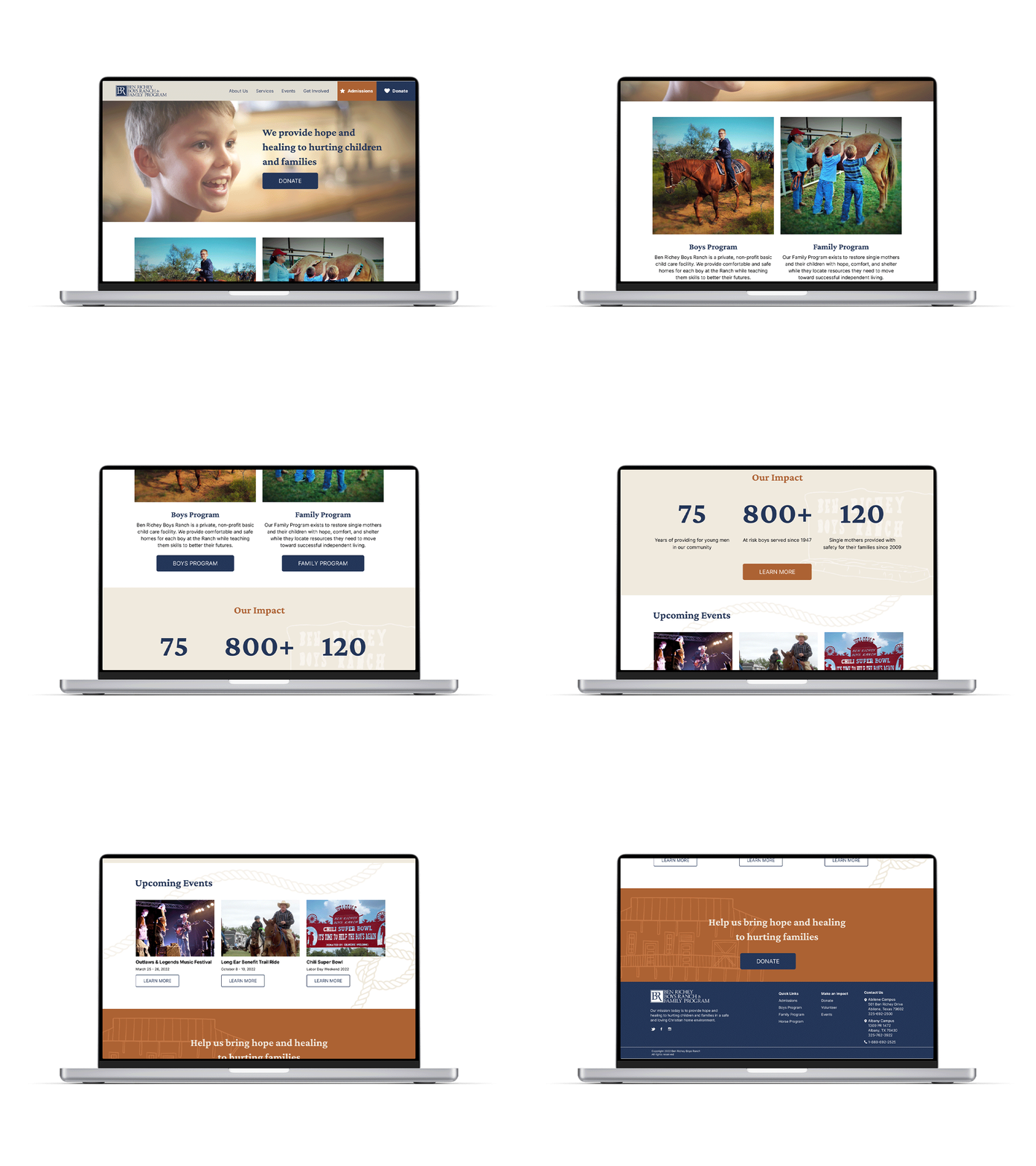
Based on this ranking, I knew I wanted the mission statement and information about the services offered displayed prominently on the homepage. The current website does not offer information about leadership, employees or board members, but I included a page on the site map that would hold all of this information and is easily accessible.
Lastly, although financial information was not as important as some of the other items, I wanted to include quick access to this to build transparency with the user by simply having it available, and I also learned that displaying financial documents on the website is necessary for some nonprofit accreditations.
User Flows and Task Flows
For the purpose of this project I chose to focus on the donation flow, which was a relatively straightforward process outlined below.
Donation Task Flow
Donation User Flow
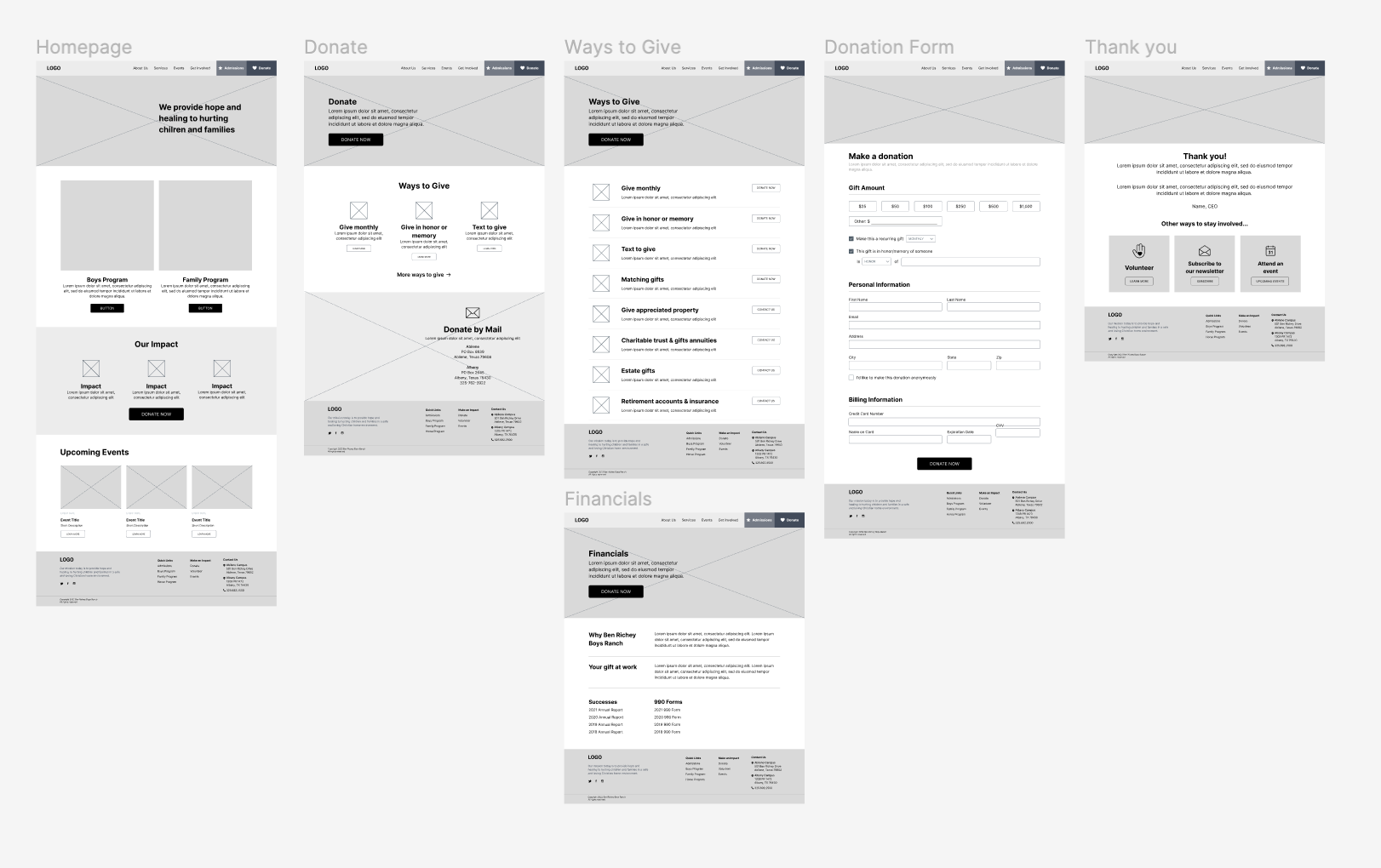
Wireframes
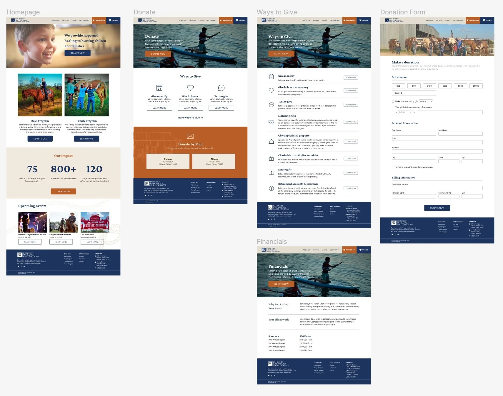
Though I focused on the donation task flow, I also wanted to build out a few other donation pages that educate the donor on the process and other ways to give. I created a page of Ways to Give that gives information on additional ways to give other than online and includes addresses for mailed donations. Although I want to move donors towards giving online, I still wanted to provide easy access for those who do give by mail since that is how the majority of their donations are currently received.
I also wanted to provide easy access to financial information, but more importantly provide a concise summary of that information since many of the people I interviewed said they do not actually read financial information.
Lastly, after the actual donation form has been submitted I wanted to make sure to show gratitude for the gift and provide additional ways for the donor to stay involved. I learned in my research that people don’t always have money to give, but they might have time or talents to share, so this provides an avenue for those opportunities.
Branding
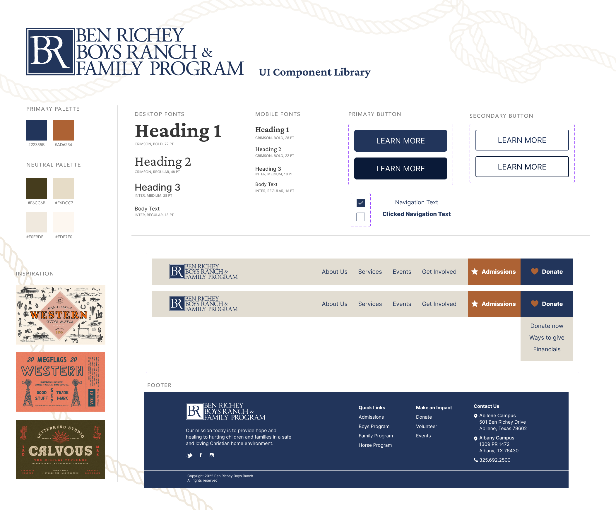
Ben Richey already had an established logo for me to use during this project, but they gave me creative freedom to incorporate other colors or graphics into the design. I wanted the site to feel western but still refined, so I added a burnt orange that reminds me of the red dirt of West Texas and adds warmth to the site along with a few warm shades of beige.
High Fidelity Wireframes
I love bringing my wireframes to life with photos and color, and this project was no different. The organization gave me a selection of photos of boys and families in their program that truly put a face to the incredible work the organization is doing. The colors bring warmth and comfort to the site, and a few western illustrations in the background bring visual interest in a way that doesn’t distract from the information, but instead draws the users’ eye to the content.
Prototyping and Testing
Next, I began prototyping and testing the website to see how users interact with the website and what they think of the process. I conducted five usability tests of the donation task flow, and also asked for general feedback on the look and feel of the site.
Determine if users can successfully make an online donation
Get overall feedback on the look and feel of the website to see if the design builds connection and conveys trust
RESEARCH GOALS
Completion: The user can complete the tasks assigned to them
No errors: The user has little to no errors when completing the task
Simplicity: The user has little to no confusion when completing the task
SUCCESS METRICS
100% of the users who tested the site and task flow were able to make a donation with no errors and thought the process was very easy. One issue I talked through with users was the “Donate Now” button on the homepage. Some thought that should take you directly to the donation form, rather than information about giving. I wanted to give the information to come before the form, so I changed those buttons to “Donate” and changed the buttons that take you to the donation form to “Donate Now.” This simple word changed may not seem like much, but it gives more clarity on where the user is going and what they are doing on the site.
Another suggestion was to add a call to action at the bottom of the homepage since many users tend to scroll through the entire page before going anywhere else. I added an additional donation section here to make use of this prime real estate in hopes of gaining more donors.
“I just tried it out and it works beautifully. I love how you have that clear sentence about who you are and what you do right on the hero. Too many organizations overlook that.” - Brandon
Final Product
Before
After
Conclusion
I loved creating this website to help this organization have a sophisticated and trustworthy online presence. Ben Richey Boys Ranch has been doing important work in their community for 75 years, and the old website did not showcase the work or give users confidence in the organization. Now, the website is both professional and heartwarming and reflects the heart of the organization in the design.
Key UX Insights: Sometimes a task flow may seem overly simple, but that’s okay! As I went through this project I kept thinking I needed to do more—make more pages and add more steps so it looks “more impressive,” but in reality a donation task flow doesn’t need to be something new and creative, it needs to be a task that donors can easily complete. I hope that a donor would go through this process and not even think about the technology because they are focused on the donation, the organization, and the impact they are making with their gift. My job as a UX designer is to think through every step of the process so a user doesn’t have to.
What I learned: In general, nonprofits have multiple target audiences with their websites - clients, donors, volunteers, and more. I originally thought of these audiences competing against one another with different messaging so I was unsure how to combine all of this one one homepage, which would be the entry point for all of these groups. However, I found from my research that seeing the mission and services a nonprofit provides is equally important to donors which lead me to prioritizing that information over information like donations and events. Now I look how different target audiences work together rather than how they compete against one another

