

Fête Case Study
ROLE
UI/UX Designer
SERVICES
UX Research
Design Strategy
Branding
Prototyping
Usability Testing
TIMELINE
80 Hours
TOOLS USED
Figma
Adobe Illustrator
Optimal Workshop
Procreate
DELIVERABLES
Responsive desktop and mobile site design
Project Overview
At a time in my life when all my friends are getting engaged, married and having babies, much of my time is spent attending showers and luncheons and hosting them for my friends. While I love celebrating my friends and have planned numerous parties, we always come across the same issues: who is in charge of what, how much money are we going to spend, and how do we know if everyone is doing what they are supposed to do.
As I talked to friends about this issue I realized we all come across these same problems and need a way to stay organized. Parties are supposed to be fun, but more often than not we are stressed about having too much on our plate rather than the purpose of the party.
Problem
Planning an even is stressful because it requires a lot of detailed organization and communication.
Solution
Create a product that makes the event planning process less stressful with tools like event management, budgeting, collaboration and guest list tracking that can be used for all types of personal events.

Research
As the end-to-end UI/UX designer, I began by conducting research amongst individuals who are often involved in party planning. The goal was to learn what problems people face when organizing an event so that I could understand what tools they need to plan an event without stress.
We want to learn what problems people face when organizing an event so that we understand what tools they need to plan an event without stress.
RESEARCH GOAL
Understand a user’s motivation for hosting an event
Discover the pain points that cause stress in the event planning process
Discover products that exist to help users plan events
Determine what tools would be useful in a product that assists with the event planning process
RESEARCH OBJECTIVES
User Interviews to gain a detailed understanding of how users currently plan events, the problems they face, and what tools could be useful to solve those issues
Competitive analysis to determine what options exist to help users plan an event
METHODOLOGIES
User Interviews
I began with user interviews to gain a detailed understanding of how users currently plan events, the problems they face, and what tools could be useful to solve those issues. I asked questions aimed at understanding their motivation for hosting an event, discovering the pain points that cause stress in the event planning process, discovering products that exist to help users plan events and determining what tools would be useful in a product that assists with the event planning process.
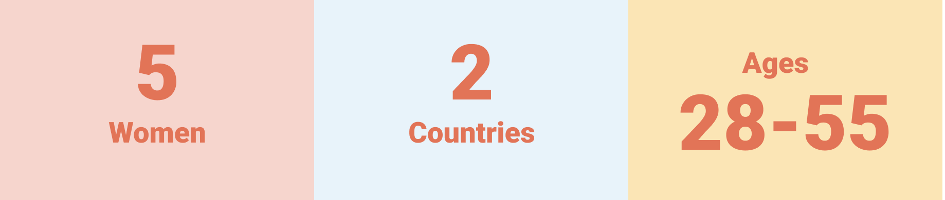
I was visiting India while conducting my research and was able to interview women involved in event planning there, and this diversity of input confirmed that these issues aren’t just issues people in the United States face, but around the world!
Key Insights
Communication between those involved in the event planning process must be clear in order to execute a successful event
Time and money are key considerations when planning an event
Many event planners want flexible tools to use while event planning and don’t have one product that meets all of their needs
Competitive Analysis
Next, I completed a competitive analysis to determine what options exist to help users plan an event. The main competitors I found were The Knot, Feztival, and Giftwalker. While all of these products had pros and cons, none of them solved all of the issues that I found event planners struggling with based on my research.

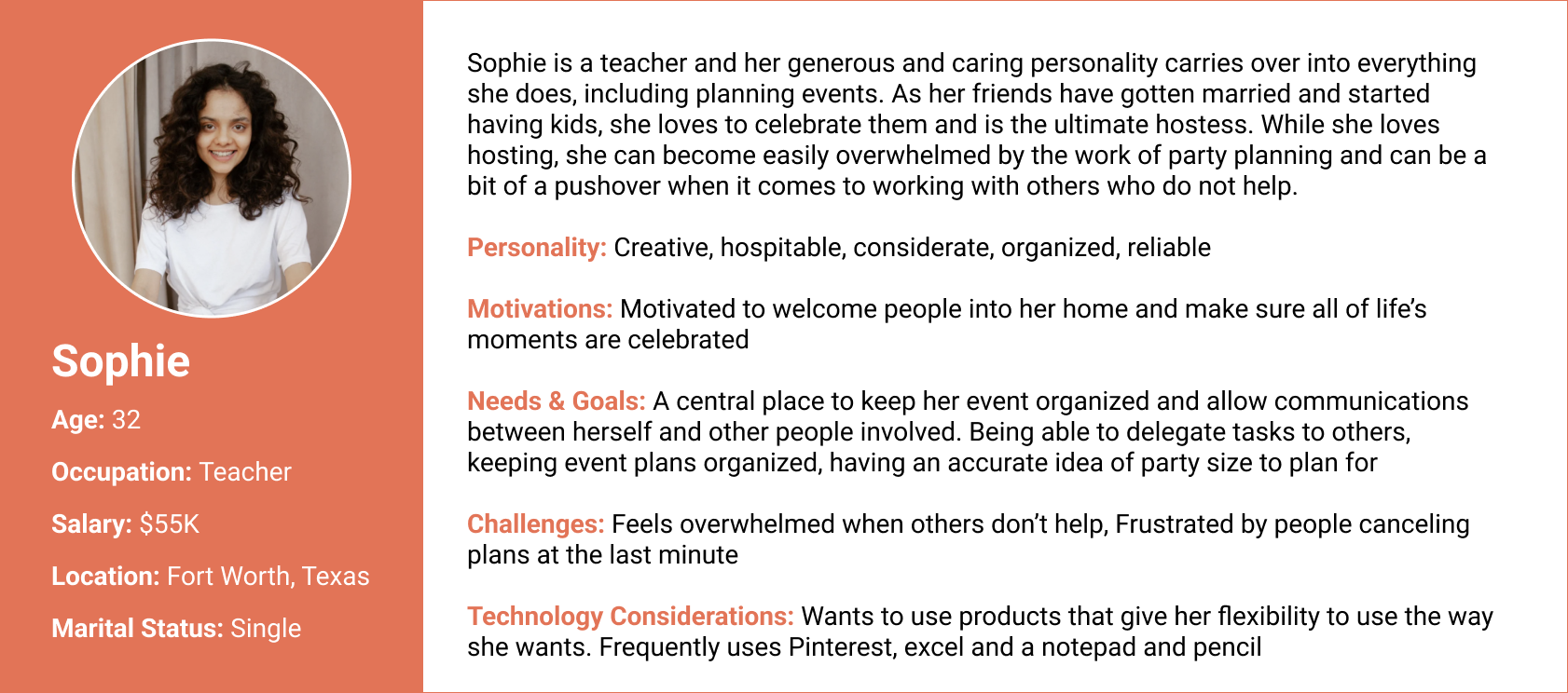
Personas
Meet Sophie and Elizabeth! These two personas embody the type of person who might use this app, which helped guide the UX design.

How might we organize event logistics and improve communication for hosts, co-hosts and guests to reduce stress caused by event planning?
HOW MIGHT WE
I’d like to explore ways to help event planners coordinate with others when planning a party so that co-hosts and guests are informed of tasks and event information because communication is an integral part of the event planning process.
POINT OF VIEW STATEMENT
HWW & POV
Before I stared the design process, I developed a How Might We statement and a Point of View statement based on the problems I found in my research to guide and keep me on track throughout the project.
Process
Creating a feature set
Once I determined the problem to be solved, I developed a feature roadmap template to determine what the product will focus on. The features I wanted this product to include included:
Event creation
Collaboration feature to plan with multiple hosts
Digital to-do list with the ability to assign tasks to other hosts and track progress
Budget
Ability to invite guests and track RSVPs
Blog with ideas and inspiration.
Card Sorting
Next, I conducted a remote, hybrid card sort with the elements I wanted to include on the site to see how potential users would categorize. I gave topics ranging from types of parties to details a party would include to be sorted among the following categories: Create an Event, My Event, Guests, My Tasks, Budget, Ideas & Inspiration, About Us and Profile. Generally, the cards that fit together were always grouped together, but they weren’t always put under the same category. But the most variable cards were invitation and registry, so I had to be very thoughtful about how I placed these in the site architecture.
Site Map
Using the analysis from the card sort, I went on to create my site map. While there are many details that could be included, I decided to keep the site map simple to allow for flexible use of the product. When looking back to my research, users most commonly used tools that allowed for maximum flexibility, so rather than requiring a user to put in every detail of their event, I stuck to broad categories that could be used the way the user wants.

User Flows and Task Flows
Because of the time constraints of this project, I chose to focus on three task flows that I thought were the most important features of my product. Those task flows were creating an account, creating an event, and creating a to do list. I kept the task flows simple, with usability for people of all ages at the forefront.
User Flow: Create an Event


Task Flow: Create an Event
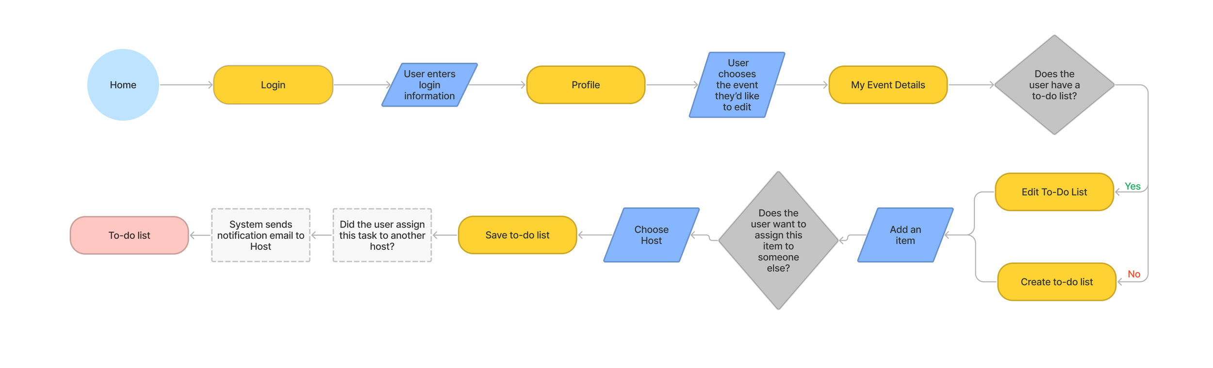
User Flow: Create a To-Do List
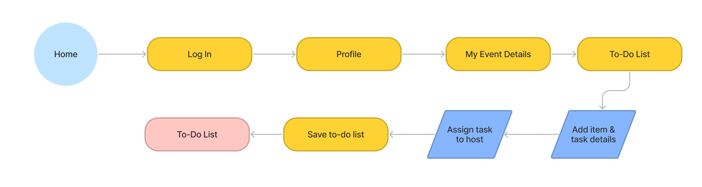
Task Flow: Create a To-Do List
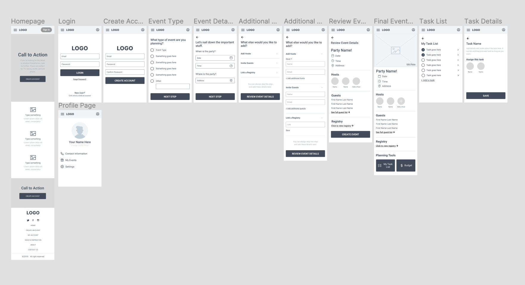
Wireframes
Once I determined the flows I would focus on, it was time for low fidelity wireframes. At this stage, I used all of my compiled research and information I had this far in the project to create screens for these flows. Again, I wanted to keep usability at the forefront by keeping the information simple and user-friendly.
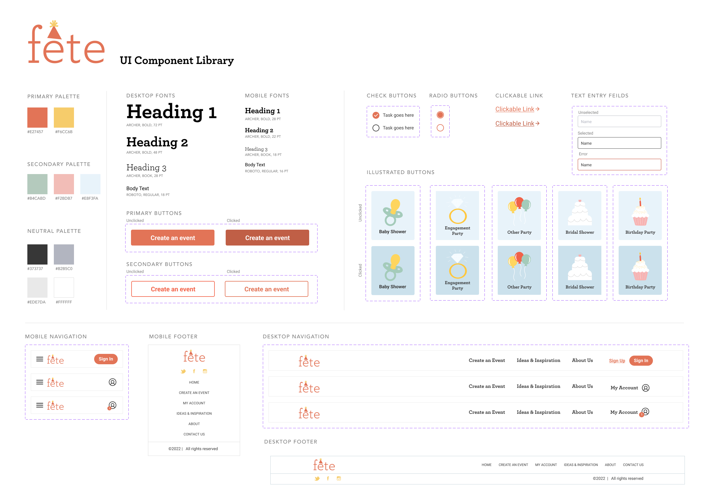
Branding
Branding was one of my favorite parts of the process, because at this stage the product begins coming to life. I wanted the brand to be simple, playful and cheerful. I chose to call the product “Fête,” which is French for party, as a simple yet chic product name.

The word lended itself to playful branding by using the accent above the “e” as a party hat. This inspired me to use other graphic illustrations throughout the product to provide visual interest and also keep the product cheerful and enjoyable to use.
I chose a color scheme that is bright and playful with orange and yellow as the primary color scheme. However, this caused some issues later in the process when the color choices did not pass accessibility tests. The yellow I chose had an extremely low score on a color contrast check, so I instead used that color for accents and in the illustrations. The orange had a higher score on the color contrast test, and although it was not high enough to completely pass the test, I chose to stick with this color in the design because the brightness was essential to the playful branding. With that in mind, I was careful of my placement of this color and made sure to keep important information in darker, neutral colors.

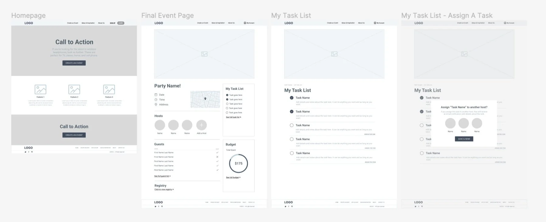
High Fidelity Wireframes
With branding complete, I enhanced my wireframes to high fidelity with color, fonts, buttons and illustrations. As I placed elements into the wireframes I narrowed down font usage to make sure the product had a clean UI design. While I chose to use the main font, Archer, in some places, I found that using my secondary font, Roboto, gave the product a clean, professional look that I wanted to achieve.
As I moved into high fidelity wireframes, I also reviewed Jakob Nielsen’s 10 Usability Heuristics for User Interface Design, and added in elements like a status bar on the event creation pages to make sure the user is informed of where they are and where they are going.


Prototyping and Testing
Prototyping and testing were the next essential steps to determine who real users would use my product. I conducted five tests–four in person and one remote. I asked users to test the three task flows I had chosen to focus on earlier: creating an account, creating an event, and creating a to-do list.
The goals of my research were:
Determine if users can successfully create an event and task list
Identify any missing details that users find necessary for creating an event and organizing event logistics
Confirm that the interface is easy to use
I measured the success of these goals with the following success metrics:
Completion: The user can complete the tasks assigned to them
No errors: The user has little to no errors when completing the task
Simplicity: The user has little to no confusion when completing the task
All of my users completed the tasks with little to no errors, and found the product simple and easy to use, and multiple said it would be helpful when planning a real event. I also received helpful feedback on a few things that could be improved.

Final Product


Conclusion
The best part of this project was showing the final prototypes to friends of mine who actually want to use it to plan their next event. After completing the project I’ve thought of multiple other features that could be added such as commenting between other hosts, or building out pages for guests to interact with the hosts.
Key UX Insights: After user testing my product, I found the importance of flexibility within the platform. Users wanted to be able to edit, delete, go back, and know where they are in the process so I made sure to make sure all features had those elements. This gives the user flexibility to change when needed and makes the tasks less scary, knowing that things can be changed later on.
What I learned: This project taught me the importance of UX research in product development. While I knew there were problems around event planning from my own experience, I learned the importance of research and interviews to discover people’s motivation for planning events and using tools to help simplify the process. This project taught me how to think with empathy to create a product that users will want to use again and again.