
Add a Feature:
iOS Contacts App
ROLE
UI/UX Designer
SERVICES
UX Research
Design Strategy
Prototyping
Usability Testing
TIMELINE
80 Hours
TOOLS USED
Figma
DELIVERABLES
High-Fidelity Prototype
Project Overview
Most of us think of our friends in categories–College friends, church friends, co-workers, etc. Sorting and grouping makes it easier to differentiate people and sometimes even remember where you met someone. But once you put a name in your iPhone Contacts, unless you assign a company to the contact or start a group text with the group of people, there’s no way to easily find that group.
Problem
The list of contacts in the iPhone Contacts app is overwhelming because doesn’t offer ways to categorize or sort people.
Solution
If you have the ability to create groups on your iPhone you have an easy way to communicate with categories of people. This would also help you remember where certain contacts are from so that you recognize people in your contact list, and clean out your contact list when you no longer need a group of contacts that are outdated.


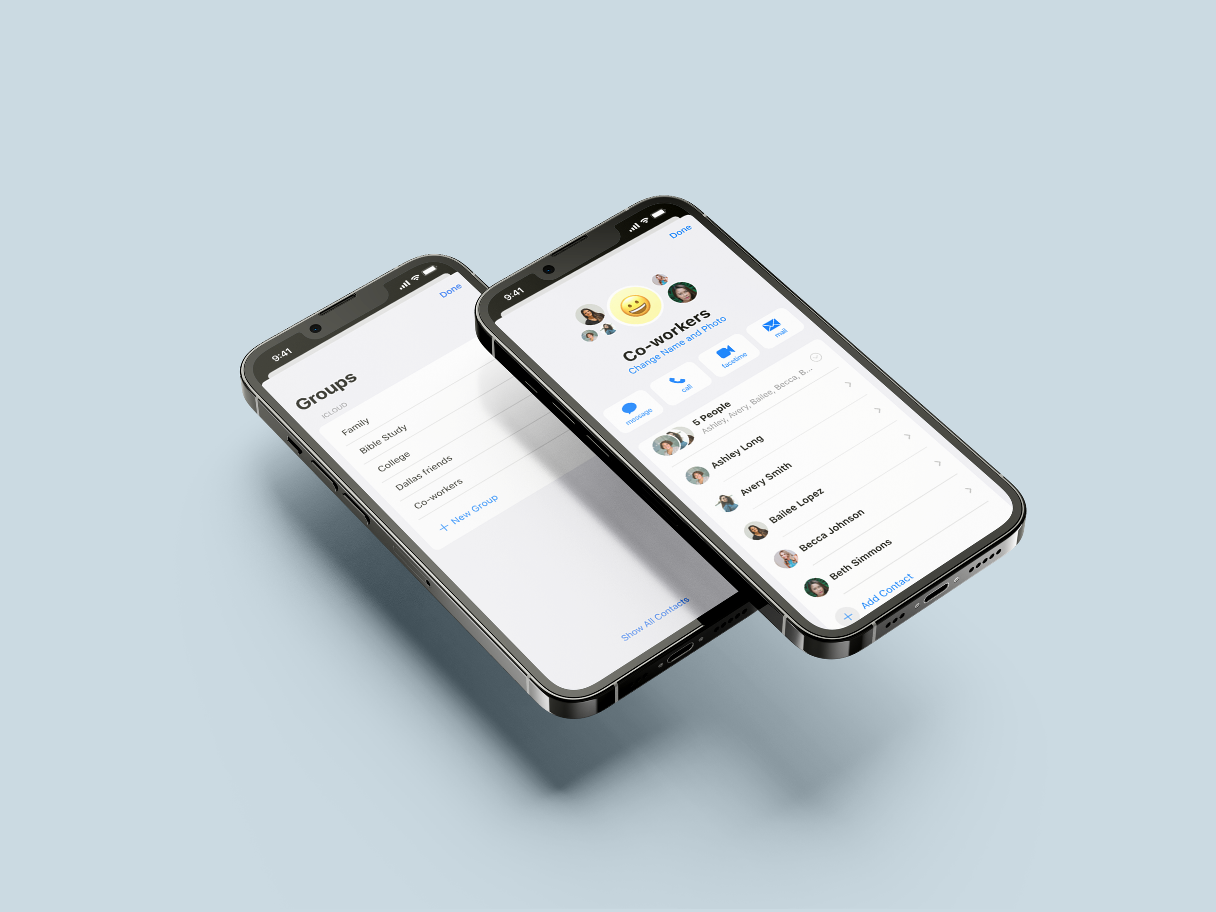
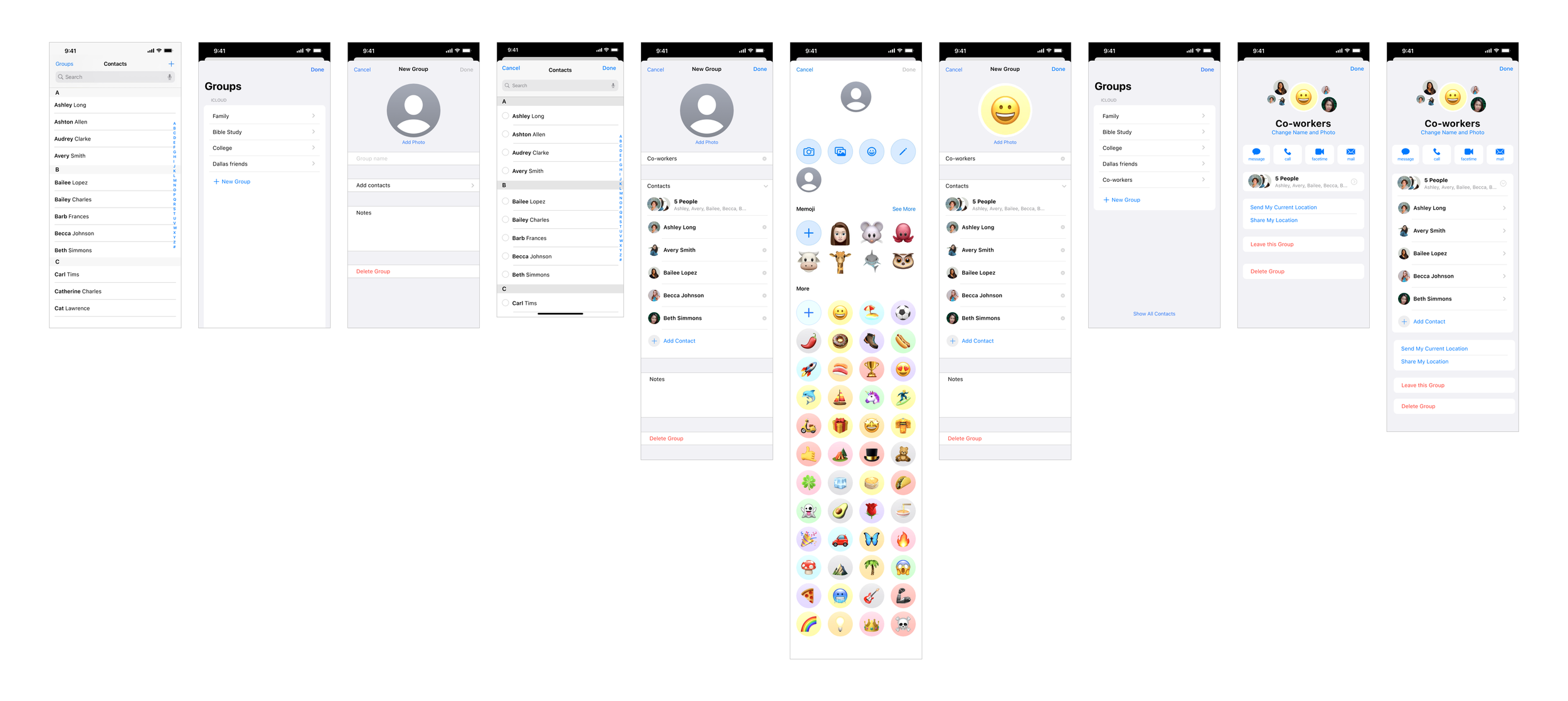
Groups screen with option to create a new group
Contacts home screen
Group screen
The Design Process

Discover
Secondary Research
Competitive Analysis
User Interviews

Define
Personas
POV Statement
HMW Statement

Develop
Features Set
Site Map
User Flow & Task Flow
Low & High Fidelity Wireframes
Prototyping and Testing

Deliver
Final Product
Research
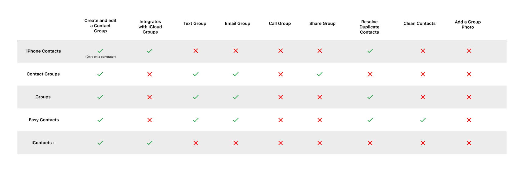
Secondary Research and Competitive Analysis
Creating Groups from iPhone Contacts
Currently you can create groups for your contacts on icloud.com from a computer. Once you drag and drop contacts into groups, you can find these groups on your Contacts App. The problem is, when you view that group it simply filters the contacts, but doesn’t create a way for you to easily communicate with that group.
One easy way to create groups on an iPhone is by creating a group text. After creating a group text, you can name the group text and easily send a text to that group, start a group call or send a group email if you have all email addresses. If the group is pinned to the top of your text messages or is one you text regularly it is easy to find, but if you haven’t communicated with the group in months or years or if you don’t know the name of the group, it can be hard to find in a list of hundreds of text messages.
Competitors
Research Insights
I interviewed 5 men and women between the ages of 26-35 to see why they use the iPhone Contacts App, if they organize their contacts and why they’d want to or not want to, and what features they’d like to be able to accomplish within this app.
After gathering my research, I created an affinity map where I narrowed down ideas and themes that were repeated.
RESEARCH GOAL
I want to understand how people use and organize iPhone contacts.
RESEARCH OBJECTIVES
Discover how users interact with their iPhone Contacts
Understand a user’s motivation for using iPhone Contacts
Discover if users know how to make groups of contacts and if they use this feature
Understand a user’s motivation for organizing or deleting contacts
Discover any pain points a user has when using the iPhone Contacts App
Discover any additional features that would enhance the iPhone Contacts App
Convenience
I found that convenience is a huge priority for people using this app. The reason many choose to use Contacts is because it is an easy way to store information and they always have their phone with them for immediate access to contact information. The app is simple and doesn’t take a lot of time to use or learn to use.
Education
No one I interviewed knew that you could create groups for contacts on iCloud, and most of them wouldn’t do that because it can’t be done from your phone. Not only should this feature be mobile-first and simple, but there will need to be education around this feature.
Attitudes
The attitudes around organizing contacts were somewhat mixed. Some where overwhelmed by the process and attributed those feelings towards laziness. To combat those feelings, I know that I need to take a user-focused approach that was simple and easy to use, and also provide enough of a value proposition to feel like the task is worth doing.
POV STATEMENT
I’d like to explore ways to help users organize their iPhone contacts in a few simple steps, because people won’t take the time to organize if the process is cumbersome and overwhelming.
HMW
How might we create a simple process for grouping contacts?
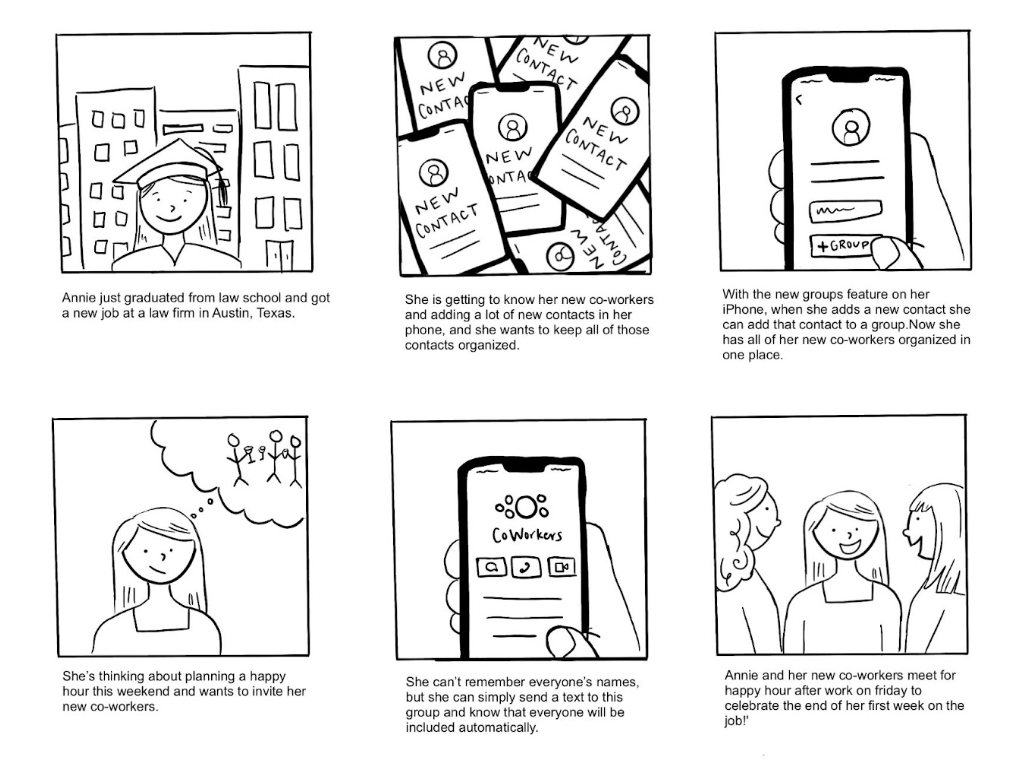
Persona

Why Annie needs this feature…
Develop
Site Map
Groups are already available on the Contacts App, just not the ability to create groups from your iPhone, so this feature already had a place in the Contacts App, I just needed to build out the process to be able to do this task from a phone.
User Flow and Task Flow
I knew from my research that the group creation process should be simple because many users had issues with other parts of the contacts app being cumbersome. With that in mind, and after reviewing competitor’s processes for creating a group, I focused on the task flow of creating a group from start to finish with options to add a contact photo with that group.
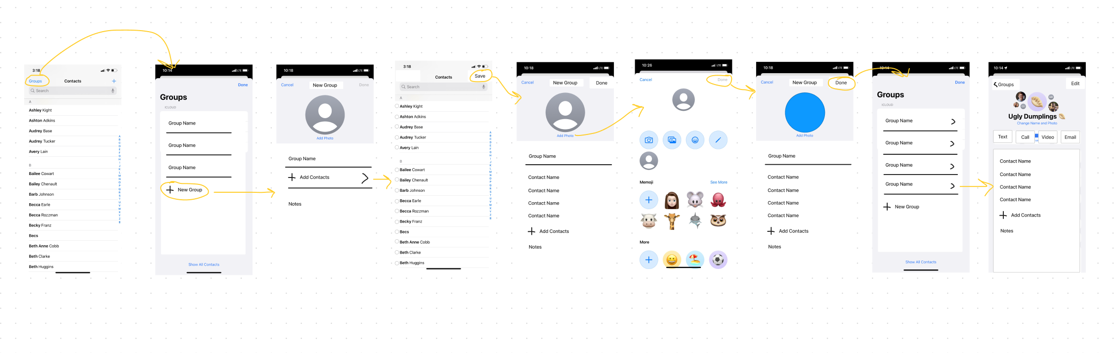
Task flow: Create a Group

User flow: Create a Group

Wireframes
With my task flow and Apple’s existing Contacts App layout in mind, I created wireframes to outline the process and initial design ideas. Apple’s products have a distinct and recognizable interface, so my design followed the existing design to create a clean and cohesive feature to this product.
High-Fidelity Wireframes
Prototyping & Testing
I conducted 5 in-person usability tests using Figma prototypes. I gave instructions for what tasks to do (i.e. create a group and add a group photo), but no assistance completing that task.
Completion: The user can complete the tasks assigned to them
No errors: The user has little to no errors when completing the task
Simplicity: The user has little to no confusion when completing the task
Success Metrics
Completion: 100% of users completed the task assigned to them
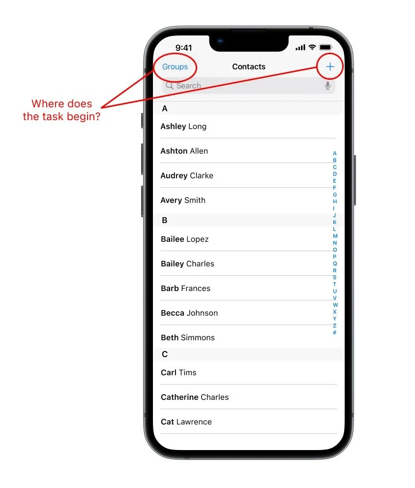
No errors: The only error some users encountered was where to begin the process. Most chose groups to start their group, but 2 out of 5 chose the plus sign, which is typically a sign for a new task
Simplicity: Other than some users choosing the plus sign over groups, users had no confusion completing the task
Results
Priority Revisions
Although there was some confusion around where to begin the task I believe keeping this feature under groups rather than adding an additional step under the plus sign is the best solution. The main issue I found that people have with the Contacts App in my initial research is that some of the processes are cumbersome and annoying. Adding a contact is the main and most important feature of this app, so I’d like to keep that process top priority. My additional feature of adding groups is a secondary feature, and I don’t want that to interfere with the contact creation process.
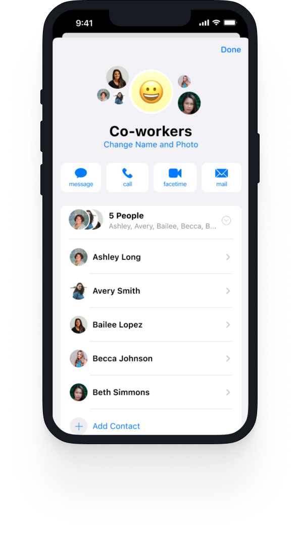
Final Product


Conclusion
Most of my usability test participants were surprised this was not already a feature in iPhone Contacts, and knowing Apple has created some group features within Contacts and on the iPhone, I wouldn’t be surprised if a feature like this is in the works.
Next Steps: With more time, I would conduct additional usability tests remotely to a larger population using a tool like Maze where I could gather quantitative data around where people are choosing to start the task–”Groups” or the plus sign. Given the time constraints of this project, I think my original solution is the best solution with the current research I have.
Key UX Insights: Mobile-first design is a priority. My research participants were surprised you could create groups within this app from a computer, and none of them would be willing to do that. In addition, there was no value proposition for them to make contact groups with the current feature. Both the final product and the process itself should always be focused on the user’s needs, which, in this case, was a mobile-first solution.
What I learned: As the UI/UX Designer on this process, I found the problem and researched and developed a tested solution. But as I saw in my initial research, part of this feature already existed and not many people were aware of it. UI/UX design should be part of a holistic process involving education and marketing to ensure users are aware of the feature and are educated on how to use it.