Preptime Meal Planning App
ROLE
UI/UX Designer
SERVICES
UX Research
Design Strategy
Prototyping
Usability Testing
TIMELINE
80 Hours
TOOLS USED
Figma
DELIVERABLES
High-Fidelity Prototype
Project Overview
Before I got married I lived with 3 other high-achieving girls who enjoyed eating well and staying busy. To save us all time during the week, we developed the “holy grail” of meal plans where one of us would cook for everyone one night a week, which gave us all 4 homecooked meals with only one night of cooking. We needed a place to keep track of everyone’s recipes so we created a shared Pinterest board of recipes to look to when we needed inspiration, and eventually added other friends to the board so that they could find inspiration and share recipes as well. And with that, we solved meal planning.
Not really … I wouldn’t have a case study if that were true. But we did have one thing going for us, and that was a place to share tried and true recipes when we needed inspiration.
Meal planning saves you time and money when done well. But lack of inspiration isn’t the only thing that makes it a chore–it can take a lot of time to make the plan itself, and there’s not a system that works for everyone.
Problem
While meal planning has benefits, many people don’t take the time to do it because it takes time to find all of the different recipes and sometimes people lack inspiration.
Solution
Preptime is an all-in-one meal planning app with preset meal plans to save you time picking out meals, a social feature to see what your friends are cooking for inspiration, a shopping list, and more. The app saves time and takes the stress out of meal planning.
Home screen
Explore meal plans
This week’s meal plan

The Design Process
Discover
Secondary Research
Competitive Analysis
User Interviews
Define
Personas
POV Statement
HMW Statement
Develop
Features Set
Site Map
User Flow & Task Flow
Low & High Fidelity Wireframes
Prototyping and Testing
Deliver
Final Product
Discover
Competitive Analysis
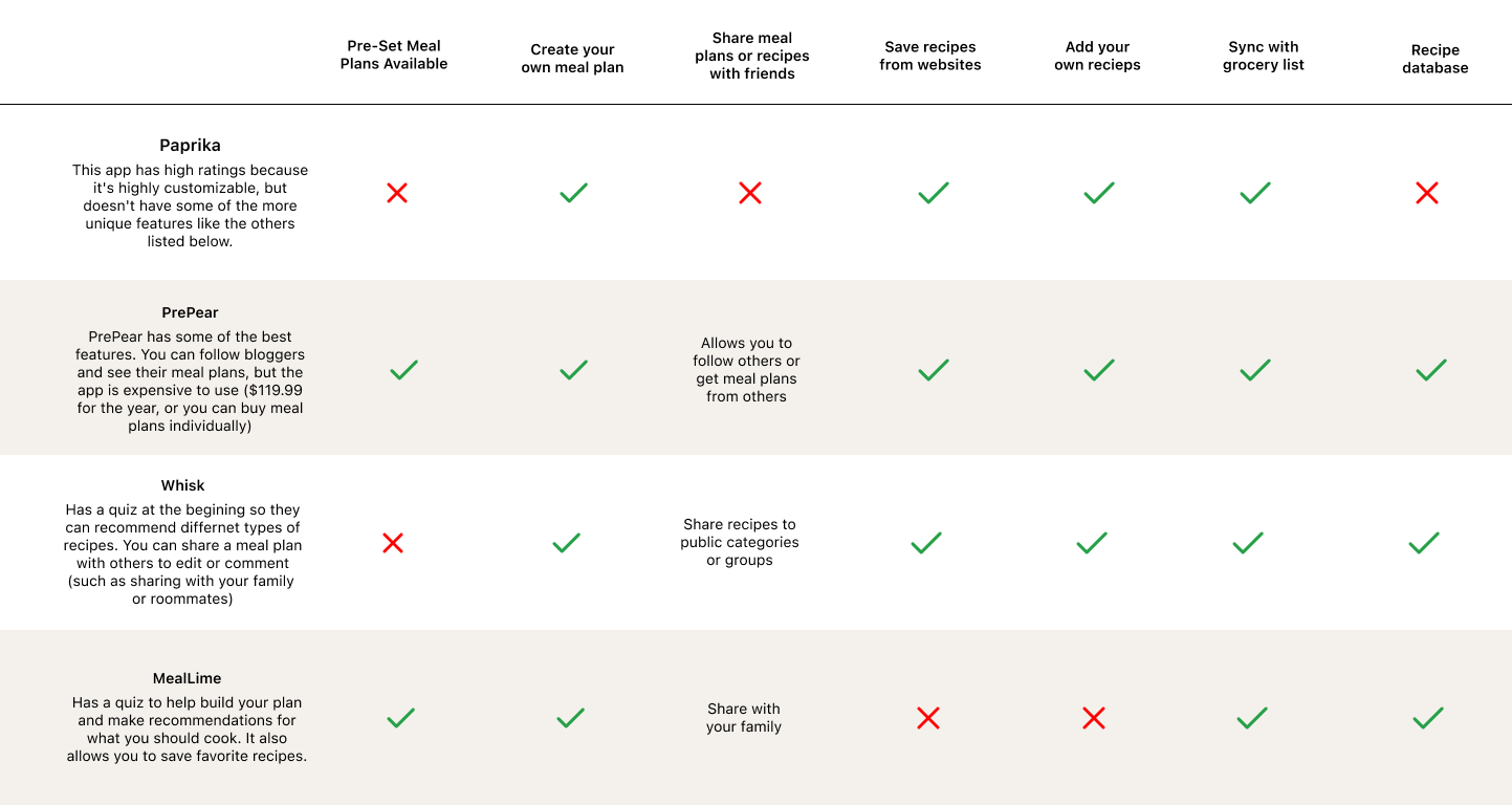
There is a wide variety of meal planning apps with many different features, so I began by comparing some of the top meal planning apps to see what features make them unique.
Survey
I created a survey to gather information about people’s experiences with meal planning and received responses from 7 people. I limited the survey to those who meal plan or have had some experience meal planning so that I could gather more accurate insights.
RESEARCH GOAL
I want to understand how people meal plan and the problems they face when meal planning.
RESEARCH OBJECTIVES
Discover user’s motivations for meal planning
Find out how people currently meal plan
Discover what prevents users’ from meal planning
Define what problems users’ have around meal planning
The most common reasons for meal planning respondents gave were to save time during the week and to avoid eating out, and the most common reason people didn’t meal plan was because of a lack of time or not knowing what to make.
The most common theme I found in my research is that people want to meal plan but they find it overwhelming or they don’t have time to do it. I know from these insights that people find meal planning rewarding, but the process can be difficult because of a lack of time or perceived stress from the planning process.
POV STATEMENT
I’d like to explore ways to prevent stress caused by meal planning because the process is rewarding when done correctly.
HMW
How might we simplify the meal planning process so that it takes people less time and energy, because people currently view the process as overwhelming.
Personas
From these research insights I created two personas to guide my product creation process.
Develop
Site Map
When creating the sitemap I prioritized the main functions of the product and created the categories of meal plans, explore, friends and shopping list which would be a part of the bottom navigation of the app and allow quick access. I also added a homepage which would share quick summaries of these categories and provide easy access to the user’s profile.
Feature Set
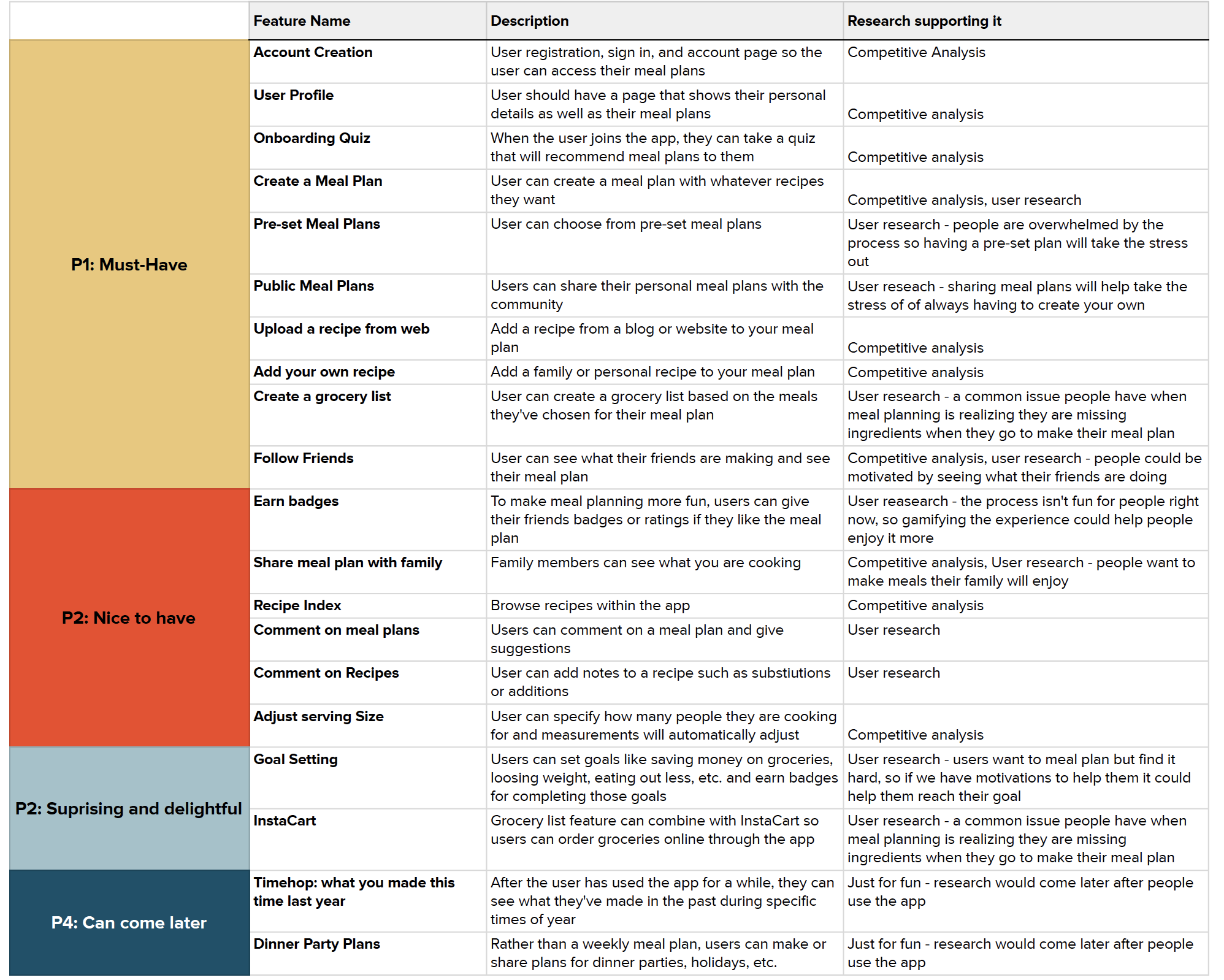
As I reviewed competitors and looked through my research I created a list of features which I then prioritized to develop a feature roadmap template.
User Flows & Task Flows
I focused on three task flows based on some of the most important features for this project: account creation, adding a pre-set meal plan to your calendar, and adding a recipe to your calendar.
User Flow: Create an Account
Task Flow: Create an Account
User Flow: Add a preset meal plan to my calendar
Task Flow: Add a preset meal plan to my calendar
User Flow: Quick add a recipe to my calendar
Task Flow: Quick add a recipe to my calendar
Wireframes
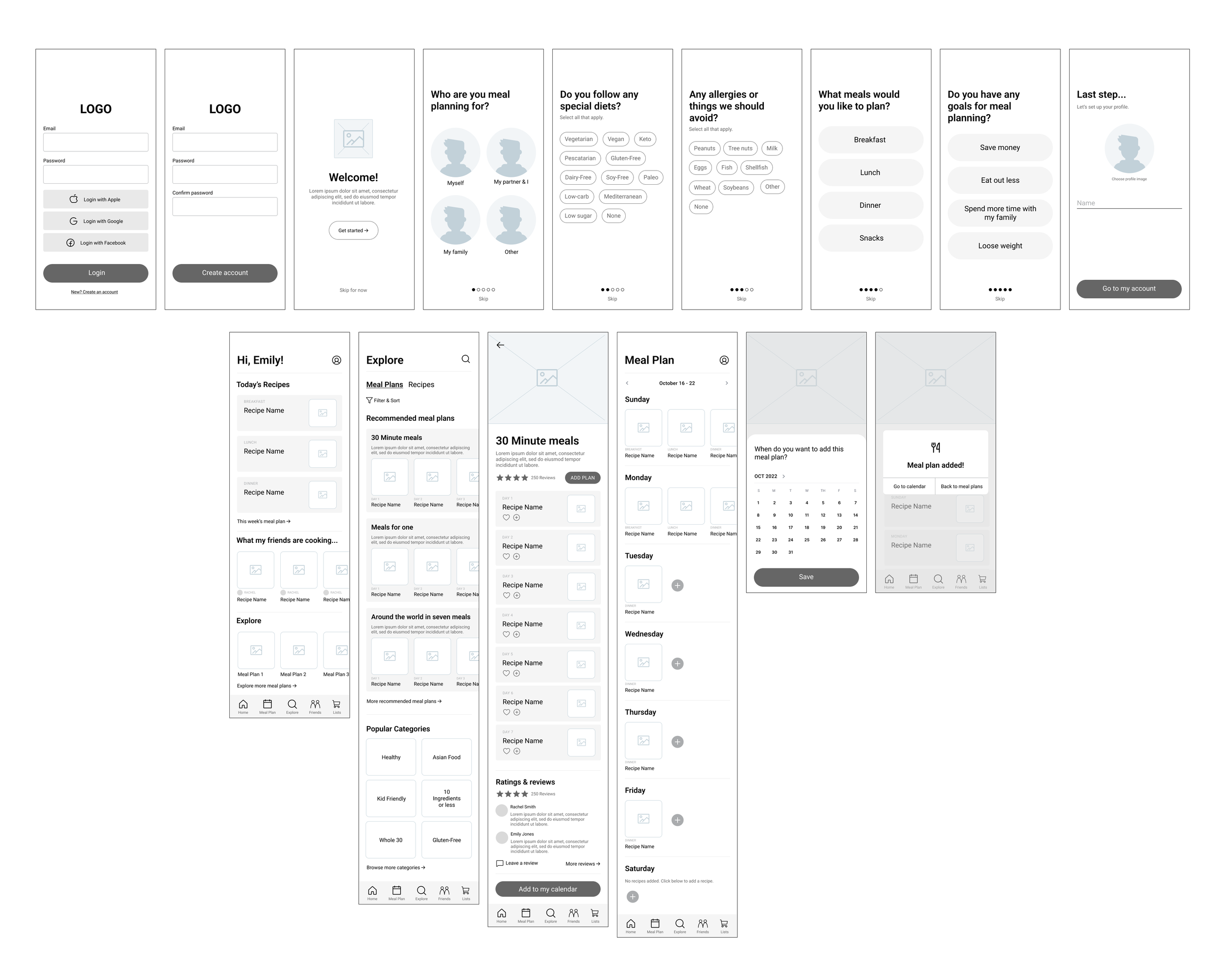
I worked from a few quick sketches to mid-fidelity wireframes based on the tasks flows I chose to build out.
I presented my mid-fidelity wireframes to a group of peers and made revisions such as:
Making sure there were options for “none” and “other” in the preferences quiz
Creating an add feature to individual recipes in a meal plan in case you want to add some recipes but not all
Changing the day listing of the meal plan from Sunday - Saturday to Day 1 - Day 7 for those planning at different times of the week (This was confirmed by my research, because there was a decent split between those who planned on the weekend and those who planned during the week)
Creating a way to bookmark or favorite recipes without adding them to a meal plan
Branding
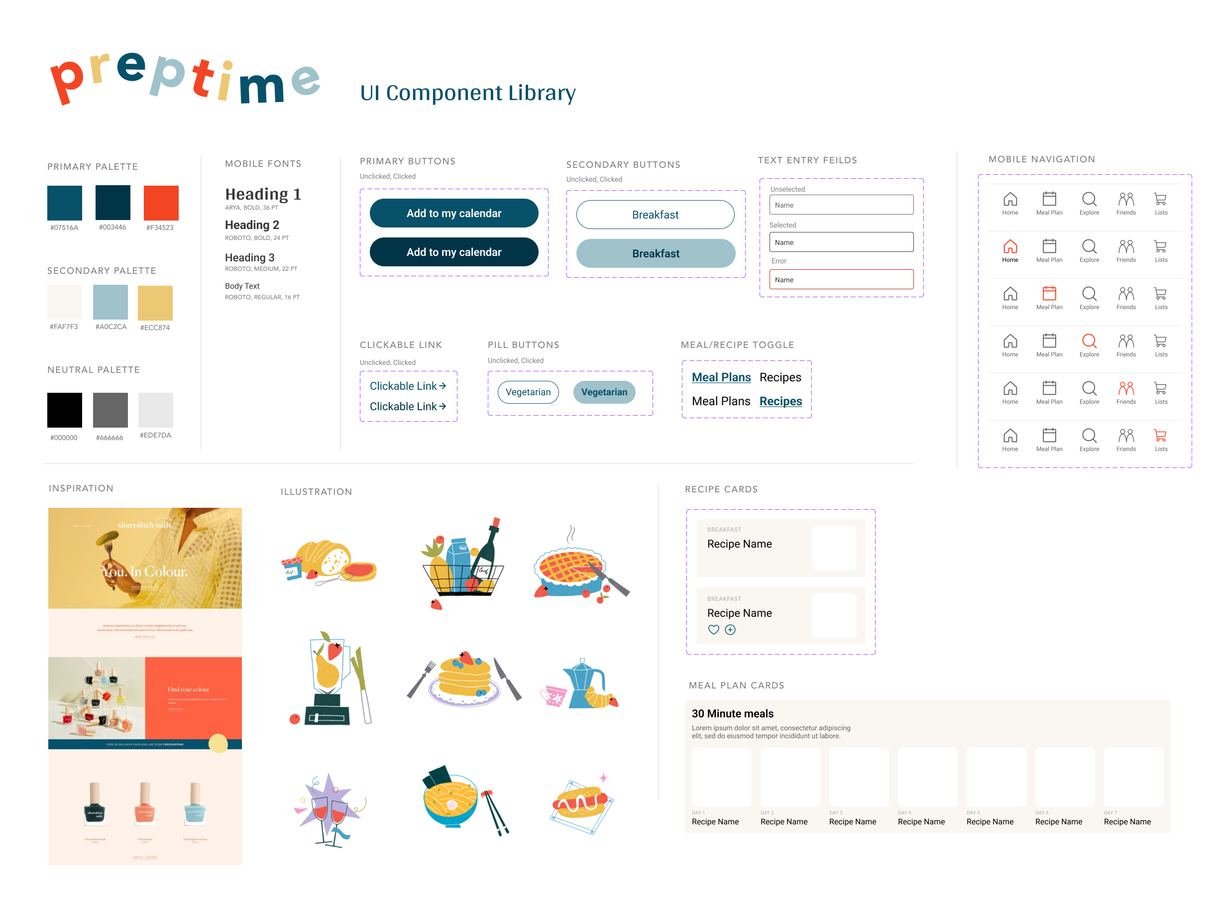
With these additions in place, I moved on to branding to develop high-fidelity wireframes. I chose the name Preptime and created a style guide inspired by retro 1950s and 60s cooking.
During the 1950s and 60s home cooks were starting to use products that helped cut down on cooking time like canned goods, box cake mixes, or casseroles that made a whole meal in one pan. It was an era of growth and saving time in the cooking world, and Preptime’s goal is the same–to save you time in the kitchen (but with a lot less casserole).
I sourced a library of images that reminded me of retro cookbook illustrations, and developed a color palette around the images.
High Fidelity Wireframes
With my UI Component Library in place, I created my high-fidelity wireframes which I then made into a Figma prototype for user testing.
Prototyping & Testing
I conducted 5 usability tests, 2 in person and 3 virtual, using Figma prototypes. I gave instructions for what tasks to do, but no assistance completing that task. The goal of the usability test was to determine if users can successfully set up an account, add a meal plan and quick add a recipe.
Completion: The user can complete the tasks assigned to them
No errors: The user has little to no errors when completing the task
Simplicity: The user has little to no confusion when completing the task
Success Metrics
Completion: 100% of users completed the task assigned to them
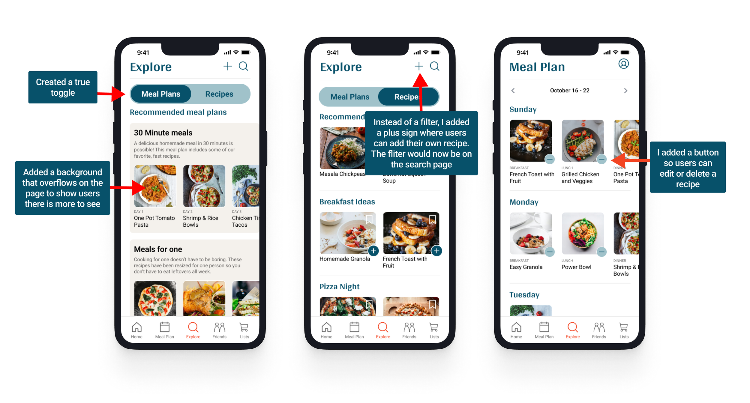
No errors: The most common errors I found were on the task to quick add a recipe. Users wanted to click the photo first and see the recipe and then add the recipe. With that in mind, I realized the quick add function is not as important as I originally thought, but there should be a clear way to add this to a meal plan after viewing the recipe.
Simplicity: All users thought the tasks were simple to complete.
Results
Priority Revisions
Final Product
Conclusion
While I still can’t split up meal planning responsibilities with my roommates like I used to, I think this product simplifies the meal planning process tremendously and still gives users the ability to share ideas with friends.
Next Steps: In addition to the pre-set meal plans, I think one of the best features of this product is the social aspect that allows you to see what your friends are making, and with more time I’d love to build out that feature and conduct more research around how users would want to interact with others in the app.
Key UX Insights: Users need guidance in their steps, and even if I think something is obvious, it may not be to everyone. I thought it was clear that a user would be able to scroll horizontally in some portions of my project because other apps use similar design patterns to show this functionality, but in my case the user needed more guidance.
What I learned: User testing and design iterations are a key part of the UX process. Coming from a background in graphic design, when something was finished it was sent to print and you didn’t have an option to make any changes. But with UX Design, finishing the design does not mean you are done. User testing allows you to see how people interact with a product before it goes out, and it’s important to gather insights to make sure your product is usable and continue making iterations. There’s always more that can be done, and by conducting usability tests we can prioritize those features.


